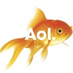
 In recent weeks AOL, a brand we have long known and sort of forgotten about, has emerged with a new identity and brand with the new moniker “Aol.” (And yes, the period is included in the new name.) This new logo was designed by Wolff Olins, who designed controversial logos for London Olympics 2012, Wacom and NYC. This new logo is not without dissent either, it’s pretty basic, white san-serif font with a period placed over an assortment of nonsensical background images, which “change continuously in an effort to suggest the breadth of AOL’s content.” The period in the logo was added to suggest “confidence, completeness,” said Sam Wilson, managing director at the Wolff Olins New York office, by declaring that “AOL is the place to go for the best content online, period.”\n\nAOL seems to be trying to find it’s footing after being under Time Warner’s thumb for the past nine years. Back in the 90’s AOL was the premier, pioneering Internet service provider. It was everywhere; becoming a catchphrase in itself. And who hasn’t seen You’ve Got Mail? But then it merged with Time Warner and instead of continuing it’s powerhouse status it became a punchline, synonymous with being outdated. Now it’s back and re-entering a landscape that has changed dramatically since its heyday. Here is a statement from AOL CEO and Chairman Tim Armstrong:\n\n”We have a new mission: to inform, entertain, and connect the world – not with more of the same but with extraordinary content experiences. This is an ambitious mission but we believe the internet needs better quality content. We have a lot of work to do, but we are hiring and developing the best creative talent in the world and we are focused on our mission of bringing world class content experiences and products to our consumers.“\n\nThe goals seem lofty and vague, as does their new identity and branding. I get that they are trying to target a new generation of users by using trendy vector art and ironic imagery with their new Aol. splashed across them. They seem to have overlooked the fact that you could take any image (use your imagination here) and easily re-create the Aol. and place it over them, which only reinforces the weakness of the concept of the shifting images. They have made it exceptionally easy to break apart their brand identity and make a mockery of it. The motion graphics they use are well executed but are lacking any type of messaging or call to action, they seem more like an unfinished demo reel then an actual advertisement. The AOL homepage is exceptionally average and looks suspiciously like the Yahoo! page. It would be an improvement to widen the width to open it up more and have quality content reign over quantity and ad space.\n\nTime will certainly tell if AOL survives and becomes relevant again. They have tough competition with the innovators over at Google, who continually come up with smart and user-friendly solutions. It is interesting to note that AOL’s CEO was a past Google Vice President. We’ll see what happens.
AOL to Aol.
 Getting the Most Out of Conferences
  The Company That Cried “Innovation” and a Ridiculous Case Study That Has To Do With Cats
  Your Products Don’t Matter