![]() This past spring Roosevelt University, a university here in Chicago with campuses in the city and one in the suburbs, unveiled a new logo, updated seal and web site. The logo is a unique icon with a folding ribbon like “R” shape in a fresh green color complemented by a bold font. As soon as I saw it, I immediately liked it. It is modern, simple and clean, all good attributes of a well done icon and logo. It is refreshing that it breaks away from what is usually expected from a university logo.\n\nA distinctive, modern-looking R logo is replacing the University’s current logotype. With its intersecting blend of greens and its unique folds, the new logo speaks to the ideas of diversity and community, important components of what the University stands for. “In the not-too-distant future, people will see the R and know immediately that it’s us,” said Roosevelt University President Chuck Middleton.\n— Press Release\n\nAlong with the new logo is a refreshed seal. It has an emblematic torch that is a nod to their history and tradition. The seal is much more simplified, which I really like because seals are often over done and busy. But the focus here is really on the torch with the founding date and Eleanor Roosevelt’s quote “Dedicated to the Enlightenment of the Human Spirit.” \n\nThe brand is significantly more modern and sophisticated from it’s predecessor. Following in the footsteps of Phoenix University who populated the billboards with their “I am Phoenix” campaign, Roosevelt University’s branding and dynamic website is well targeted, dynamic and a nice compliment to the new logo design. The new home page has a rotating student gallery with stories and photos complimented with vibrant color and fun type to illustrate life on campus.\n\nOther branding efforts is this great signage that are downtown:\n\n
This past spring Roosevelt University, a university here in Chicago with campuses in the city and one in the suburbs, unveiled a new logo, updated seal and web site. The logo is a unique icon with a folding ribbon like “R” shape in a fresh green color complemented by a bold font. As soon as I saw it, I immediately liked it. It is modern, simple and clean, all good attributes of a well done icon and logo. It is refreshing that it breaks away from what is usually expected from a university logo.\n\nA distinctive, modern-looking R logo is replacing the University’s current logotype. With its intersecting blend of greens and its unique folds, the new logo speaks to the ideas of diversity and community, important components of what the University stands for. “In the not-too-distant future, people will see the R and know immediately that it’s us,” said Roosevelt University President Chuck Middleton.\n— Press Release\n\nAlong with the new logo is a refreshed seal. It has an emblematic torch that is a nod to their history and tradition. The seal is much more simplified, which I really like because seals are often over done and busy. But the focus here is really on the torch with the founding date and Eleanor Roosevelt’s quote “Dedicated to the Enlightenment of the Human Spirit.” \n\nThe brand is significantly more modern and sophisticated from it’s predecessor. Following in the footsteps of Phoenix University who populated the billboards with their “I am Phoenix” campaign, Roosevelt University’s branding and dynamic website is well targeted, dynamic and a nice compliment to the new logo design. The new home page has a rotating student gallery with stories and photos complimented with vibrant color and fun type to illustrate life on campus.\n\nOther branding efforts is this great signage that are downtown:\n\n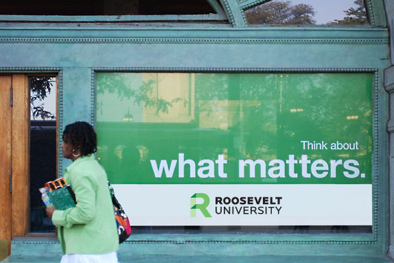 Armed with a new logo, seal and website, I think that the future of Roosevelt University is looking bright. The new contemporary look will certainly get noticed and their equity will continue to rise. And hopefully other colleges and universities will recognize the value of re-branding and increased marketing efforts, and will call us when they are ready. \n
Roosevelt University gets Refreshed
 More than Sauce: Branding Diversity
  Getting the Most Out of Conferences
  Innovate Authentically: The importance of purpose when trying something new
I’ve been browsing online more than 3 hours today, yet I never found any interesting article like yours. It’s pretty worth enough for me. In my view, if all website owners and bloggers made good content as you did, the internet will be a lot more useful than ever before.