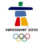
 Every four years, a city is chosen to host the Olympic games. Among the many responsibilities for hosting is the challenge to create a unique brand that captures the spirit and culture of a country, for one of the oldest and most celebrated sports traditions. The great city of Vancouver, Canada rose to the challenge of creating this brand and achieved it with great success. Overall I think they did an impressive job with the entire look and feel and thought that it was fresh, exciting and fun.\n\nThe 2010 logo is simple, colorful and representative of the history and culture of the country. For centuries, the Inuit people of Canada’s Arctic stacked rock in human form to create the inukshuk, a stone landmark that provided direction for food and navigation. Over time, the inukshuk has become a symbol of hope and friendship, an expression of hospitality that welcomes people with open arms every day. This inukshuk tradition was transformed to create the iconography of the 2010 Olympic logo, the contemporary interpretation of the stone formation is paired with clean san serif typography. There is a nice choice of using all lowercase letters which compliments the stout and boxy shape of the icon.\n\n
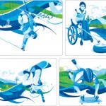 What I think I like the most of this brand is the color palette. The choice of the acidic green and cerulean blue were brilliant, the colors really stand out on the wintery white slopes of Vancouver. The color blue represents water in its many forms (ocean, lakes, ice, snow), while the green represents the growth of vegetation and natural resources of the area. These colors bring to life the dynamic illustrations, which are representative of each sport. They are sleek and have a modern superhero feel to them. With each one of them, you can feel the action of the event and can see the power and spirit of the athlete in beautiful detail. The background of each of these is surrounded by swirling waves that include detailed aspect of both the environment and canadian culture.\n\nI am already looking to see what will be done with the branding of the 2012 London Summer Olympics. They are off to an interesting start with the logo, we will see what happens with the rest of the brand.
2010 Vancouver Olympic Brand Review
 Getting the Most Out of Conferences
  The Company That Cried “Innovation” and a Ridiculous Case Study That Has To Do With Cats
  Your Products Don’t Matter